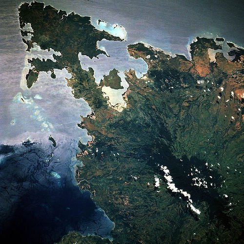
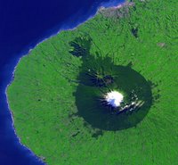
Northern madagascar from space
Increasingly it appears that the greatest challenge facing humankind is to sustainably manage the limited resources of the planet Earth, in the face of human
overpopulation and increasing material demands of modern human societies. We still know too little about the detailed interactions of the
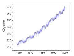
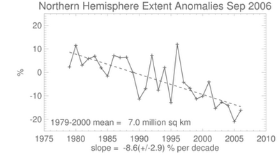
biosphere and global climate to be certain of the long term consequences of human-induced
global warming. However we do know that the huge and growing human population on the planet is leaving a large footprint on the global
ecosystem. The long term consequences of human-driven global
deforestation and wholesale transformation of land usage of the planet Earth are anything but predictable (see Box 1).
 Box 1
Box 1: This satellite picture of
Egmont National Park and the surrounding area shows that the original native forests (dark green) of the east coast of the North Island of New Zealand have been largely replaced by argicultural pasture lands (light green). Only the circular national park boundary around Mt Taranaki appears to be providing protection against further land use transformation, and without the national park designation, even more deforestation would undoubtedly occur. The park's circular shape originates from its first protection in 1881, at which time it was specified that a forest reserve would extend from the summit of Mt. Taranaki in a 9.6 km radius. The park covers 33,534 hectares and its peak is 2518 metres above sea level.
The human-driven removal of large swaths of primary forests in New Zealand and worldwide are playing a large role in the changing dynamics of the planet's carbon cycle. The long-term consequences of this transformation of the planet's surface for the global climate and biosphere are not yet clear. The
original image was produced by NASA in May 2001.
As a global society, humans need to understand the finite nature of the planet's natural resources and reorganize our behaviours to reflect this finite supply.
A tiny
yeast population in a test tube of nutrients initially grows exponentially, unimpeded by the ultimately limited nature of the available resources. However at some point the population of yeast cells become so large that they compete for the remaining resources. In short order the population growth stagnates, as individuals scavenge for the rapidly diminishing left overs of previously unfettered consumption, while also contending with the increasing concentration of waste products of that consumption. Finally the whole population of yeast crash as the resources are completely exhausted and expended. Humans are currently still on the growth part of the curve, but the transition to decline and ultimate extinction can be extremely rapid. Luckily for us, unlike the test tube, the Earth is provided with a continual input of new energy from the Sun. However humans rely heavily on the global climate and ecosystem to harness this energy and convert it into usable resources like
tuna and
rice. Without a productive and healthy biosphere, we will be hard-pressed to find much nourishment from
solar panels alone. We need to learn how to rationalize our energy consumption and restrict our ever-expanding encroachment on all other life on the planet. If we don't do this the consequences could be difficult or impossible to live with. There is no reason why New Zealand should wait for other countries to lead in the battle for a sustainable future. Smart people should apply themselves to this problem immediately and challenge the
status quo.