
Policy Webs and the Coalition Game
| ACT | Greens | Labour | Maori Party | National | NZ First | Progressive | United | |
| ACT | - | 12% | 47% | 26% | 64% | 60% | 28% | 56% |
| Greens | 12% | - | 63% | 84% | 45% | 52% | 83% | 47% |
| Labour | 47% | 63% | - | 65% | 65% | 69% | 69% | 67% |
| Maori Party | 26% | 84% | 65% | - | 53% | 62% | 78% | 54% |
| National | 64% | 45% | 65% | 53% | - | 70% | 56% | 61% |
| NZ First | 60% | 52% | 69% | 62% | 70% | - | 61% | 67% |
| Progressive | 28% | 83% | 69% | 78% | 56% | 61% | - | 54% |
| United | 56% | 47% | 67% | 54% | 61% | 67% | 54% | - |
By itself, this table makes for interesting reading. For example, it shows that, on environmental policy, the two most similar parties are the Greens and the Maori party, being 84% similar. Whereas the two most different parties are (unsurprisingly) the Greens and ACT, having only 12% common policy ground. As you would expect Labour and National are both fairly central. The Labour party shares more than 60% policy similarity with all other parties apart from ACT, while National shares greater than 50% similarity with all other parties except for the Greens. NZ First is the only party that somehow manages to maintain 50% similarity with all of the other parties, making them the most versatile party when it comes to coalition talks.
Although this table makes for interesting reading, sometimes a picture is even better. Its possible to turn these numbers into graph that visually illustrates the policy affinities of all the parties in a single picture. To do this we need to borrow some analysis tools used in evolutionary biology. Using standard software when can generate a graph that summarizes all these relationships by using a table of pairwise differences. It is trivial to convert Table 2 into just such a set of differences. For example the 12% similarity between Greens and ACT will convert to an 88% difference. With these differences (known in evolutionary biology as distances, and usually calculated based on the differences between pairs of DNA sequences) we can now use standard computer software to calculate a graph called a Neighbour Net, which provides a compact summary of pairwise similarities. The resulting graph (which I will dub a Policy Web) is shown in Figure 1.
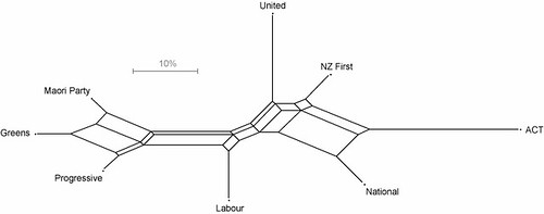
Figure 1 - Environmental Policy Web for 8 New Zealand political parties. The scale bar provides an idea of the approximate percentage difference that the edges in the graph represent.
One observation from the Policy Web is that the Greens, the Maori party and the Progressive Party form a policy clique advocating a strong focus on environmental issues. The second observation is that ACT is out on a fairly long policy limb compared to the other parties. The distance along the shortest path in the graph between two parties in the Policy Web is representative of the amount of difference between their respective policy packages. The Policy Web provides an at-a-glance summary of the relationships between different party’s policies. If it were used across the board, it should provide a quick insight into what coalition combinations actually make sense for a given policy area. Based on environmental policies, the Maori Party should be in coalition with the Greens, and could not possibly sit comfortably with parties such as ACT, National and United Future.
posted by Alexei @ 1:31 AM
![]()
![]()
0 Comments:
Post a Comment
<< Home